IRIS makes a grand entrance
Alright, let me take you back to October 11, 2024. me, my wife, and a hospital labour room buzzing with nerves and hope. My little girl Iris was on her way, and my wife was powering through contractions, we had this wild idea, to build something, I mean except for the contractions there was nothing much else to do. So I hunched over my laptop, hammering out this code to track the contractions. It’s not the slickest thing I’ve ever written, and it’s definitely not some utopian masterpiece, but it’s THE best project I’ve ever done. Someday, Iris might read this and get a kick out of her dad and mom writing numbers out while she was making her grand entrance.
Why I Even Started This
We’re in the labour room, my wife’s gripping my hand, and the doctors asked us to time the contractions at first, how long they last, how far apart they are. It’s chaos, and I’m thinking, “I can do this better.” I’d been jotting down times on my phone, and I figured, why not throw it into a machine and see the patterns? So, between reassuring my wife and pacing the room, I built a contraction tracker—start times, durations, frequencies..all plotted out. It kept me sane, gave us data, and now it’s a keepsake from Iris’s first day.
What I Was Working With
I had a list of timestamps..66 of them..starting at 13:03:15 on October 11, 2024, and running past 17:56 (plus one outlier at 21:31 I trimmed later). These were when each contraction kicked off, down to microseconds because, well, precision felt right. Then, durations—how long each one lasted in seconds, from a quick 2.4 to a hefty 244. And frequencies—time between starts, calculated as:
where tit_it_i is the start time of contraction ( i ). First one’s None since there’s no “before.” I dumped this into a dictionary and turned it into a pandas DataFrame—df—with Start Time as the index, parsed as datetimes with pd.to_datetime.
Simple but Real Numbers
No fancy equations here, just basic arithmetic and some time juggling. For duration, it’s straight-up seconds—how long my wife felt each squeeze. Frequency’s the gap between starts, so for contraction ( I ):
To see patterns, I grouped contractions into 10-minute buckets. That’s just flooring the timestamps to the nearest 10 minutes—think ⌊t/600⌋⋅600, if you’re converting seconds from a base time, but pandas does it with index.floor('10T'). Then, I counted how many landed in each bucket:
That’s it—simple sums and differences, but enough to spot trends when you’re bleary eyed and counting minutes.
Messy Coding
I used pandas for data wrangling and matplotlib for graphs. Loaded the data into a DataFrame, set the index, and plotted three things first:
fig, ax = plt.subplots(3, 1, figsize=(10, 10))
ax[0].plot(df.index, df['Duration (seconds)'], marker='o', linestyle='-', color='b')
ax[1].plot(df.index, df['Frequency (seconds)'], marker='o', linestyle='-', color='g')
ax[2].bar(contractions_per_10min.index, contractions_per_10min, width=0.008, color='r')
Then, I added a fourth plot to show each contraction’s span:
ax[3].scatter(df.index, [1] * len(df), color='b')
for i, row in df.iterrows():
     ax[3].hlines(y=1, xmin=i, xmax=i + pd.to_timedelta(row['Duration (seconds)'], unit='s'), color='b')
It’s rough, written fast between contractions, but it worked. The first three plots were duration over time, frequency over time, and a bar chart of contractions per 10 minutes. The fourth was a timeline—dots for starts, lines for how long each lasted. I stretched the x-axis with set_xlim to fit the longest duration. Not elegant, but it got the job done.
What I Saw
Here’s where it gets real:
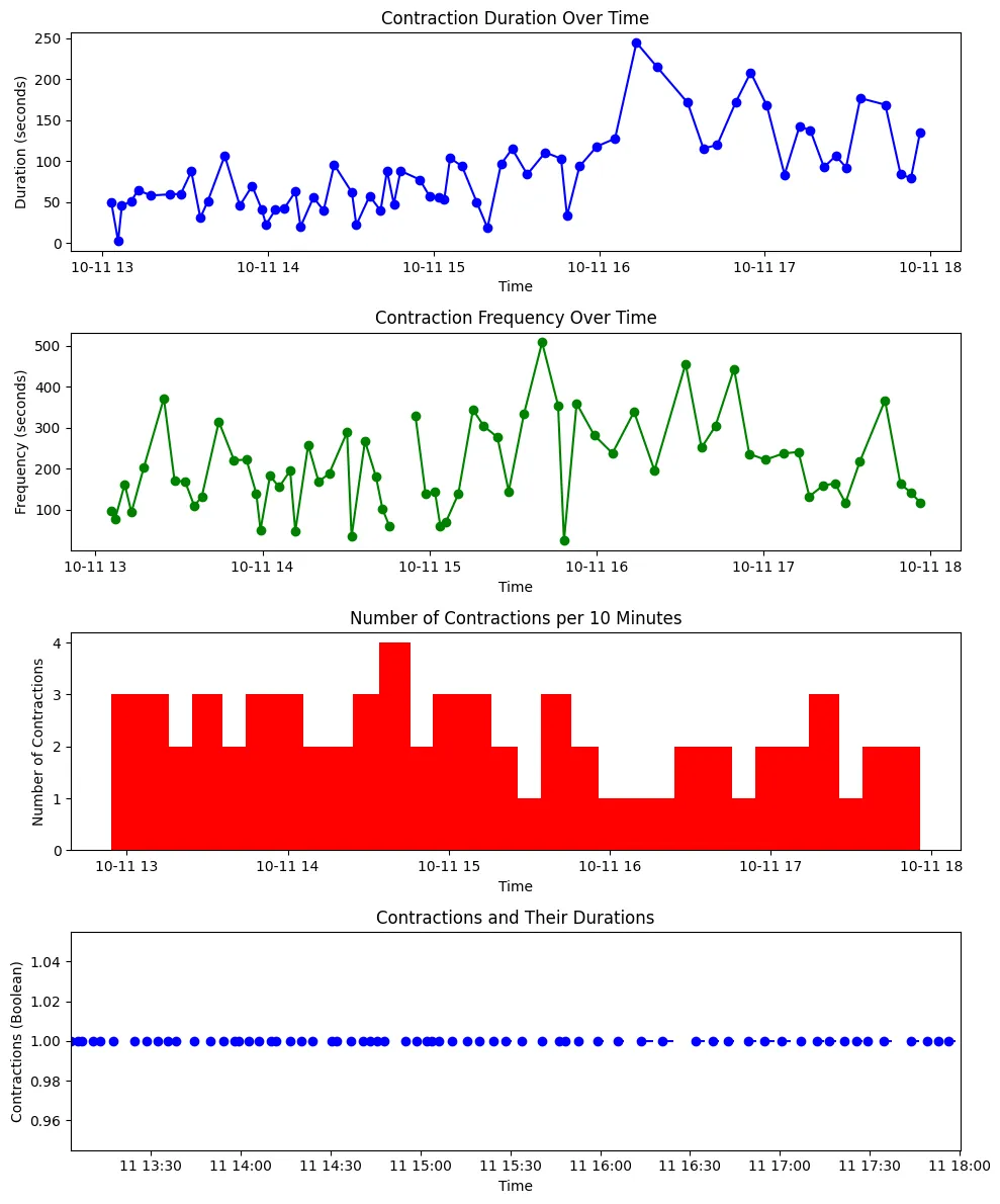
Top Plot (Duration): Blue line with dots, each contraction’s length in seconds. It starts around 49, dips to 2.4 (a blip!), then climbs later, some hitting 200+. No steady pattern, just labour doing its thing.
Second Plot (Frequency): Green line, time between starts. Early on, it’s erratic—98 seconds, then 371, back to 51. Later, it tightens up, some as low as 25 seconds—showing things speeding up.
Third Plot (10-min Count): Red bars, how many contractions per 10 minutes. Starts at 2-3, peaks around 5-6 later, then drops. A clear ramp up as we got closer.
Bottom Plot (Timeline): Blue dots and lines, each dot’s a start, each line’s the duration. You can see them bunching up toward the end, durations stretching out.
The Story in the Numbers
The data’s raw, just 66 contractions from 13:03 to 17:56—but it paints a picture. Early on, durations bounced around 40-60 seconds, frequencies all over (50 to 370 seconds). By 15:00-16:00, frequencies dropped below 200 seconds more often, and durations crept up—some past 100, even 244. The 10-minute count peaked around 16:00-17:00, hitting 6 contractions, then eased off. That fourth plot showed it best—gaps shrinking, lines lengthening..Iris was coming fast.
What It Meant to Me
This wasn’t just code..it was us, in that room, waiting for Iris. The plots showed labour picking up, fewer minutes between, longer squeezes. Was it perfect? Of course not, I wrote it half panicked, hands a bit shaking. Could’ve smoothed the data, added stats like mean duration: or variance , but I didn’t need that then. It told us what mattered..things were moving, and fast.
For Iris someday: "hello Iris, this is your dad at one of his most stressed and happiest. It’s not fancy, but it’s yours. I tracked your mom’s strength, and you arrived—perfect. Best project ever? Of course, because it’s tied to you."
Why It’s Special
I’ve built plenty, a lot of mathematical models.. control systems of small satellites in geostationary orbits, aerodynamic lift capability in Martian atmosphere etc..but this? This was real-time, real-life, with my wife’s courage and Iris’s first cry as the payoff. Maybe Iris’ll tweak it one day, add some fany new spin to it or whatever’s hot in 2040. For now, it’s our little timestamped memory.