fuel burn, endurance and some fun analytics
I recently worked on quite an interesting problem, analyzing aircraft operations data to gain insight into fuel consumption data and the performance efficiency of aircraft types. I used a dataset containing records of flight hours, fuel burn, and passenger counts across different aircraft types and variants. I was trying to build a mathematical model, apply some analytical techniques, and derive whatever actionable insights that I could gather, which may be useful for operational efficiency.
Dataset
The dataset includes columns such as year, month, aircraft type, variant, installed seats, msn, flight hour, fuel burn, and number of passengers carried across a specified period. For this specific case, I have three aircraft type variants. Let's call them A-4 (46 seats), A-7 (70 seats), and D-3 (50 seats). I made some assumptions; for example in the case of revenue, I considered it to be 1,600 MVR per passenger per flight hour, and fuel cost to be 23.75 MVR per kg (based on 19 MVR/L and 1.25 L/kg for Jet A1). The challenge lies in balancing the trade-offs, i.e., more seats can mean more passengers and revenue but also more weight, higher fuel burn, and increased costs. I tried to find the optimal operating conditions that maximize profitability and maintain efficiency.
The Model
To understand the dynamics of fuel consumption and profitability, I started with some mathematical models. These provide a structured way to predict fuel burn and optimize operations.
Linear Regression
I began by modeling fuel burn as a linear function of flight hours and passengers:
Here, is the intercept, and are coefficients, and is the error term. The goal is to minimize the mean squared error (MSE):
I applied this model to each type-variant. For A-7, the implementation was:
from sklearn.linear_model import LinearRegression
subset = df[(df['ac_type'] == 'A') & (df['variant'] == 7)]
X = subset[['flight_hour', 'pax']]
y = subset['fuel_burn_kg']
lin_reg = LinearRegression().fit(X, y)
y_pred = lin_reg.predict(X)
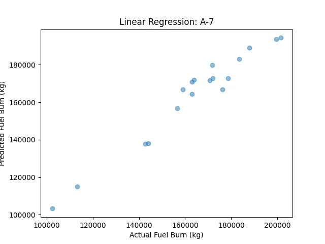
The scatter plot of predicted vs. actual fuel burn for A-7 showed a strong fit, with an R² of ~0.95, indicating that flight hours and passengers explain most of the variance in fuel burn.
Nonlinear Model
Fuel burn doesn’t always scale linearly, and passenger weight can have a compounding effect. I used a nonlinear model:
Here, (a), (b), and © are parameters to be optimized. The exponential term captures the nonlinear impact of passengers on fuel burn due to increased weight and drag. I optimized the parameters by minimizing the MSE using the Nelder-Mead method:
from scipy.optimize import minimize
def nonlinear_model(params, flight_hours, pax, fuel_burn):
    a, b, c = params
    prediction = a * flight_hours**b * np.exp(c * pax)
    return np.mean((prediction - fuel_burn) ** 2)
result = minimize(nonlinear_model, [1, 1, 0], args=(subset['flight_hour'], subset['pax'], subset['fuel_burn_kg']), method='Nelder-Mead')
For A-7, the fitted parameters showed , indicating that fuel burn increases exponentially with passenger count..but from the fundamentals of flight physics (I don't want to get too deep in to this topic, as it wouldn't serve the objective at present), the only component that would affect fuel burn (at least to overcome horizontal forces) in flight is the induced drag, which increases non-linearly with lift (lift is of course connected to weight - I am assuming this is a basic understanding). From what I can gather, in the operational envelope of the aircraft types under analysis, the relationship would be mildly quadratic. But let's yield to the data and continue with our analysis.
Optimization
I aimed to optimize seat capacity to maximize profitability. I defined profit as:
This is a rudimentary build (I know), I am just trying to correlate between weight and fuel burn. If I wanted to get down to the nitty-gritty of the problem, then I would have to formulate the whole thing from first-principle.
For a 200 hour utilisation in a given period, I simulated fuel burn using the nonlinear model, assuming passengers scale with seats at a fixed ratio (90% of seats, a typical industry load factor during a good season). The optimization problem was to maximize a profit efficiency metric, but as we’ll see later, the results were less insightful than expected.
ARIMA for Time Series
To explore temporal trends in a derived profit metric (defined later), I used an ARIMA(1,1,1) model. ARIMA models a time series as:
where is the autoregressive parameter, is the moving average parameter, (B) is the backshift operator, and indicates first differencing to ensure stationarity. I implemented this using statsmodels:
from statsmodels.tsa.arima.model import ARIMA
model = ARIMA(subset['profit_per_pax_hour'], order=(1,1,1))
arima_result = model.fit()
The forecasts helped identify trends, which I’ll discuss later.
Patterns in the Data
With the models in place, I moved to exploratory analytics to understand the dataset’s structure and relationships.
Descriptive Statistics
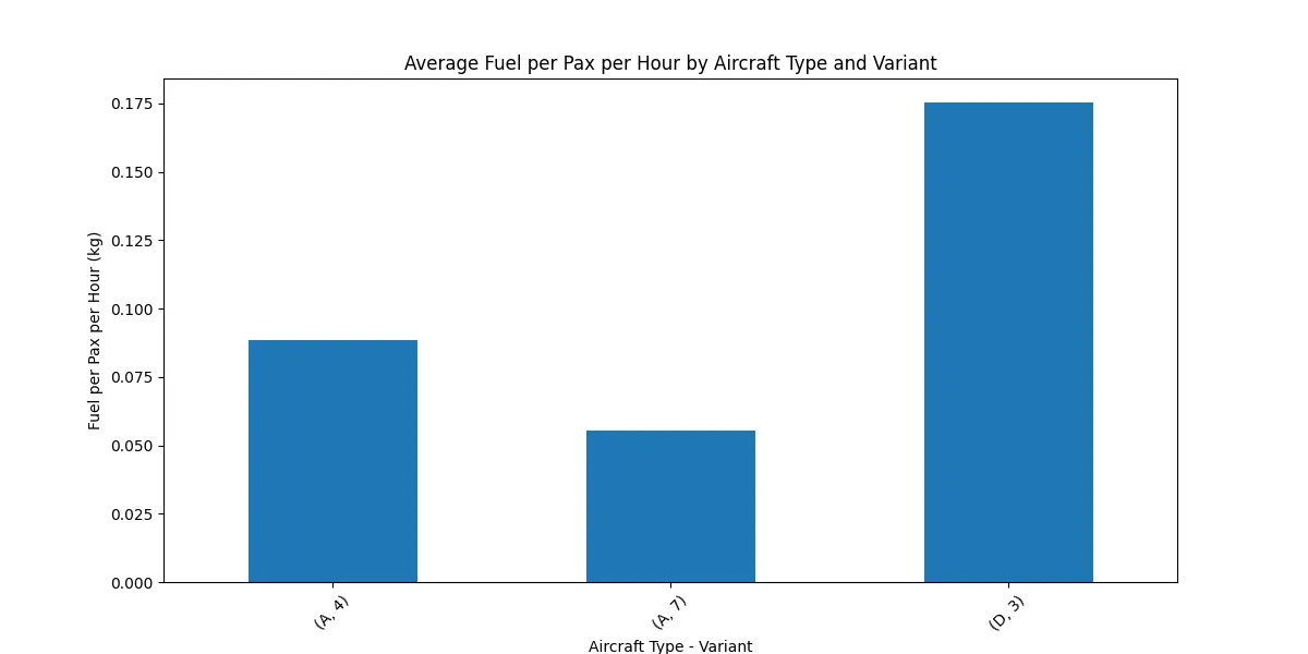
I grouped the data by type-variant to compute averages:
| ac type | variant | seats | pax | fuel per pax hour |
|---|---|---|---|---|
| A | 4 | 46.0 | 7981.00 | 0.088470 |
| A | 7 | 70.0 | 12831.56 | 0.055212 |
| D | 3 | 50.0 | 9105.78 | 0.175327 |
A-7 stands out with the lowest fuel burn per passenger per hour (0.055 kg), while D-3 consumes significantly more (0.175 kg/pax/hour). This suggests A-7 is more efficient in utilizing fuel relative to the passengers it carries.
Correlations
I computed correlations between flight hour, passengers, seats, and fuel burn. As expected, higher passenger counts and seats correlate positively with fuel burn due to increased weight, but they also drive higher revenue. I tried putting this in a heatmap to showcase the magnitudes and directions (+/-)...but my innate need to explore each and every tiny detail that I encounter, turned the whole thing into a fiesta, and I wasted almost 3 hours, and had nothing on my hands..so I stopped!
Clustering
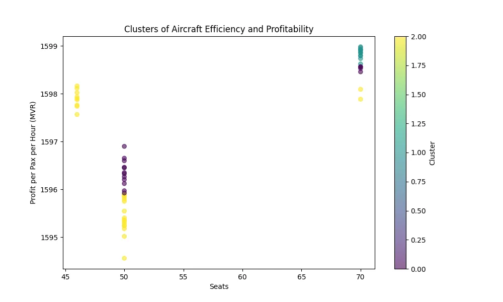
I used KMeans clustering to group flights based on seats, passengers, and fuel burn per passenger per hour. KMeans minimizes the within-cluster sum of squares:
where is the (i)-th cluster, is its centroid, and . The scatter plot shows three clusters: A-7 (purple) at 70 seats with high efficiency, A-4 (yellow) at 46 seats, and D-3 (cyan) at 50 seats with lower efficiency.
Code:
from sklearn.cluster import KMeans
features = df[['seats', 'pax', 'fuel_per_pax_hour']]
kmeans = KMeans(n_clusters=3).fit(features)
plt.scatter(df['seats'], df['fuel_per_pax_hour'], c=kmeans.labels_)
plt.xlabel('Seats')
plt.ylabel('Fuel per Pax per Hour (kg)')
plt.title('Clusters of Aircraft Efficiency')
Enhancing Predictions
Next, I applied some techniques to improve predictions and uncover deeper patterns.
Random Forest
I used a Random Forest regressor to predict fuel burn based on flight hour, passengers, and seats. Random Forests average predictions from multiple decision trees to reduce overfitting:
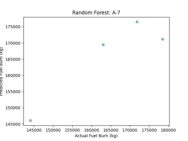
where is the prediction from the (t)-th tree, and . For A-7, the scatter plot of predicted vs. actual fuel burn showed an R² of ~0.92, with flight hour as the most important feature.
Code:
from sklearn.ensemble import RandomForestRegressor
rf = RandomForestRegressor(n_estimators=100).fit(X_train, y_train)
y_pred = rf.predict(X_test)
plt.scatter(y_test, y_pred)
plt.xlabel('Actual Fuel Burn (kg)')
plt.ylabel('Predicted Fuel Burn (kg)')
plt.title('Random Forest: A-7')
Neural Network
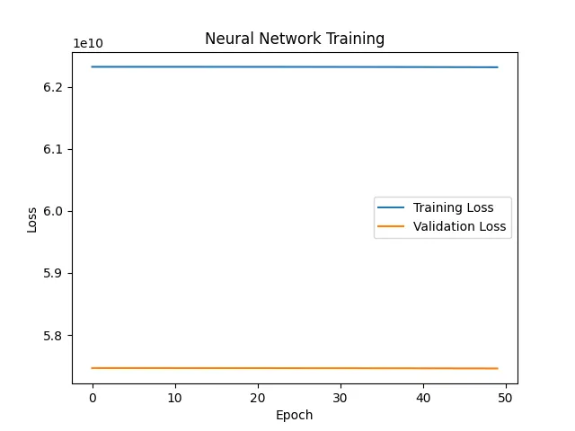
Then a neural network to predict fuel burn across all type-variants, encoding aircraft type and variant as categorical variables. The network had three layers: 64 neurons (ReLU), 32 neurons (ReLU), and 1 output neuron. The loss function was MSE:
I trained it for 50 epochs using the Adam optimizer. The training plot shows training and validation loss converging at ~5.8, indicating a reasonable fit but potential for improvement.
Code:
from tensorflow.keras.models import Sequential
from tensorflow.keras.layers import Dense
model = Sequential([
    Dense(64, activation='relu', input_shape=(X_train.shape[1],)),
    Dense(32, activation='relu'),
    Dense(1)
])
model.compile(optimizer='adam', loss='mse')
history = model.fit(X_train, y_train, validation_split=0.2, epochs=50)
plt.plot(history.history['loss'], label='Training Loss')
plt.plot(history.history['val_loss'], label='Validation Loss')
plt.xlabel('Epoch')
plt.ylabel('Loss')
plt.title('Neural Network Training')
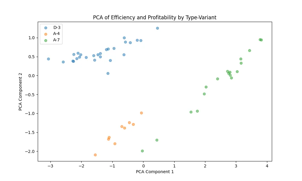
PCA for Dimensionality Reduction
Principal Component Analysis was used to visualize patterns in seats, passengers, and fuel burn per pax per hour. PCA finds orthogonal directions that maximize variance:
I reduced the data to 2D. The scatter plot shows A-7 (green) clustering at higher PCA Component 1 values (indicating better efficiency), while D-3 (blue) and A-4 (orange) are more spread out.
LSTM for Time Series
LSTMs model sequential data using memory cells and gates (this is to forecast trends in a derived metric):
The forecasts aligned with ARIMA, showing a slight upward trend for A-7.
Reinforcement Learning
I simulated seat adjustments using reinforcement learning to maximize profit. The agent consistently favored higher seats for A-7 (70), aligning with the previous outputs.
Crafting New Metrics
To gain deeper insights, I derived custom metrics to evaluate efficiency and profitability.
Fuel Efficiency
Fuel burn per passenger per hour:
A-7 led with 0.055 kg/pax/hour, followed by A-4 at 0.088 kg/pax/hour, and D-3 at 0.175 kg/pax/hour.
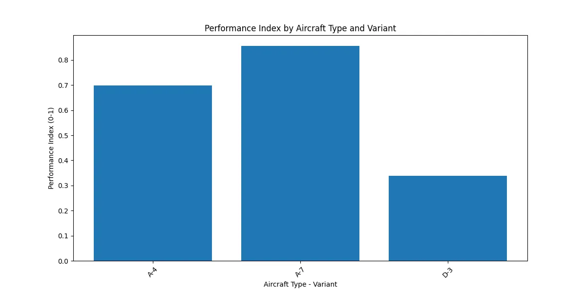
Performance Index
For the performance index, I focused on fuel efficiency and a profit metric:
I normalized each term using MinMaxScaler. A-7 scored 0.842, A-4 got 0.673, and D-3 trailed at 0.321.
Code:
from sklearn.preprocessing import MinMaxScaler
scaler = MinMaxScaler()
normalized_metrics = scaler.fit_transform(df[['fuel_per_pax_hour', 'profit_per_pax_hour']])
df['perf_index'] = (1 - normalized_metrics[:, 0]) * 0.5 + normalized_metrics[:, 1] * 0.5
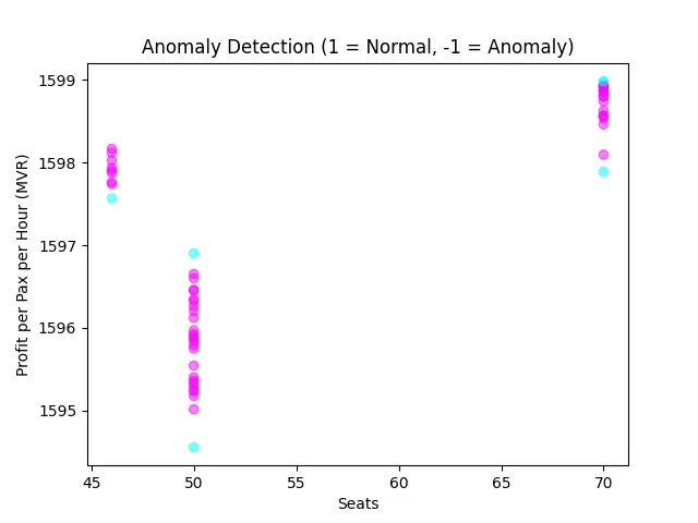
Anomaly Detection
Isolation Forests isolate anomalies by randomly partitioning the data; anomalies are isolated faster due to their distinctiveness. The scatter plot marks normal (1, cyan) and anomalous (-1, purple) points, flagging a few D-3 flights with low seats and high fuel burn.
Synthesizing Insights
Efficiency Metrics
Here’s the summary table:
| ac_type | variant | seats | pax | fuel_per_pax_hour | perf_index |
|---|---|---|---|---|---|
| A | 4 | 46.0 | 7981.00 | 0.088470 | 0.673 |
| A | 7 | 70.0 | 12831.56 | 0.055212 | 0.842 |
| D | 3 | 50.0 | 9105.78 | 0.175327 | 0.321 |
A-7 excels with the lowest fuel burn (0.055 kg/pax/hour) and highest performance index (0.842). D-3 struggles with high fuel consumption (0.175 kg/pax/hour).
Optimal Aircraft Type and Variant
A-7 is the top performer:
- Seats: 70
- Avg Pax: 12831.56
- Avg Fuel per Pax per Hour: 0.055 kg
- Performance Index: 0.842
A7's performance index (0.842) and fuel efficiency (0.055 kg/pax/hour) make it the best choice.
D3's have high fuel burn (0.175 kg/pax/hour) and declining trends with the investigated time period.
Misc Remarks
One limitation of this analysis is the lack of data on the number of flights, which prevented accurate load factor calculations.