Cracking the Propeller Engine Code
I ran a spectral analysis on an audio recording of an aircraft engine during its takeoff run, and the conclusion I reached at the end of it is not the one I set out to find. The frequency content of the recording is real, it survives every method I applied to it, but the engine power reading I wanted to build on top of that frequency content does not survive, and here I try to covers both, the method as I actually ran it and the exact point at which the method stops supporting the conclusion. The recording itself and where it came from I will keep confidential (I know the aircraft, the conditions, and the reason the recording exists, which accounts for some behavior in these plots that the plots alone would not explain), so what is public here is the method only.
I did the work in Python using librosa, which is the standard library for this kind of audio decomposition. The first step is loading, y, sr = librosa.load(audio_file_path, sr=None), which returns two objects, y, an array holding the amplitude of the signal at every sample, and sr, the sample rate, the number of samples taken per second. Setting sr=None matters more than it looks, since it keeps the file at its native rate of 44,100 Hz instead of resampling it to a rate that would be more convenient for the library and less faithful to the recording.
The second step is the Short-Time Fourier Transform, stft = librosa.stft(y). A full Fourier Transform would give me every frequency present in the recording taken as a whole, which is close to useless for an engine whose state changes second by second, since a frequency that appears only during the roll would be reported as if it belonged to the entire file. The STFT instead cuts the signal into short overlapping windows, 2048 samples each by default, runs a Fourier Transform on every window separately, and stacks the results into a matrix of frequency against time. Formally, for a signal x(t),
where w(t) is the window function (Hann, unless told otherwise), t is time, f is frequency, and j is the imaginary unit. The output is complex, so I separated it with stft_magnitude, stft_phase = librosa.magphase(stft) into magnitude, which carries how loud each frequency is at each moment, and phase, which carries the timing of the waveform. All of the interpretation in this post runs on the magnitude, and the phase is needed only once, later, to invert a filtered spectrum back into a signal.
On this class of aircraft the propeller and engine noise should live between 50 Hz and 2000 Hz, low rumble at the bottom of that range and a higher whine toward the top. To isolate the band I first had to know which row of the STFT matrix corresponds to which physical frequency, which frequencies = librosa.fft_frequencies(sr=sr, n_fft=stft.shape[0]) provides, following:
with k the bin index and n_fft the window size of 2048. Then propeller_bins = np.where((frequencies >= 50) & (frequencies <= 2000))[0] picks out the bins inside the band, everything outside them is zeroed, and filtered_y = librosa.istft(filtered_stft * stft_phase) inverts the result back into a time-domain signal, reattaching the phase so the reconstruction is coherent. The point of this whole step is hygiene, that is to say that anything found downstream of it belongs to the propeller band and cannot be blamed on wind, cabin noise, or airframe vibration.
On that filtered signal I ran peaks = find_peaks(filtered_y, height=0) from scipy.signal, which marks every sample that rises above its neighbors and above zero, and converted the gaps between successive peaks into seconds with intervals = np.diff(peaks) / sr. It should be noted that these intervals came out scattered, some a fraction of a second apart, some several times longer, with no periodic structure in them at all, and I want to hold that result rather than explain it away, because it becomes informative near the end.
The same magnitude data in visual form is the spectrogram, produced with librosa.display.specshow(librosa.amplitude_to_db(stft_magnitude, ref=np.max), sr=sr, y_axis='log', x_axis='time'). The decibel conversion is:
and since ref is the loudest value in the recording, every number on the plot is loudness relative to that single loudest moment, not loudness in any absolute or calibrated sense, a detail that matters for everything that follows.
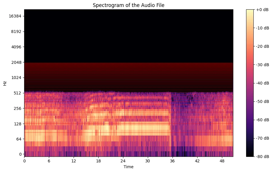
The band from 50 to 2000 Hz, marked in red, stays energetic through the entire takeoff segment, which confirms that the propeller and engine are producing sound across the whole run, and confirms nothing beyond that.
To get one loudness curve for the band instead of one per frequency, I summed the magnitude across the propeller bins at every time step, propeller_sum_magnitude = np.sum(propeller_magnitude, axis=0), and ran find_peaks on the sum with the threshold set at np.mean(propeller_sum_magnitude) + 2*np.std(propeller_sum_magnitude), the mean plus two standard deviations, which on a normal distribution admits roughly the loudest 2 percent of moments.
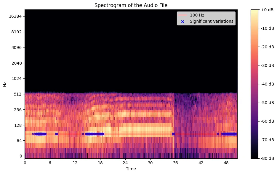
The blue crosses land where the spectrogram already looks busiest, and one should be careful about how much comfort to take from that, since a threshold constructed from the data's own mean and variance is guaranteed to place its peaks wherever the data is loud, that is to say the method here confirms its own construction and tests nothing external to itself.
It is essential for my argument to pause here and distinguish between two things that the analysis, left to itself, keeps fusing into one, the measurement and the inference. What the microphone measures is amplitude, the pressure of sound arriving at one point in space, filtered through a particular gain setting. What I want from the analysis is engine power, the mechanical output of the machine. The entire remainder of this project consists of treating the first as a proxy for the second, and that treatment is an assumption I am making, not a property of the data.
One might rightly say that the assumption is a reasonable one, since a hard-working engine is a loud engine, throttle and noise move together in the experience of anyone who has sat behind a propeller, and the acoustic energy of the exhaust and the blades does genuinely rise with power. All of that is true. What it does not give me is a mapping, because the amplitude arriving at a microphone also depends on the distance to the source, the angle to it, the reflections of the environment, and the recording gain, none of which have anything to do with the engine, and I have no calibration against which to separate these effects, no simultaneous torque or power reading taken while the recording was made. From this then it follows that every "power" curve in the plots below is an amplitude curve wearing a label I chose to give it.
With that stated, I isolated 100 Hz, finding its bin with specific_bin = np.argmin(np.abs(frequencies - 100)), pulling the magnitude series of that bin alone, and running the same peak hunt on it.
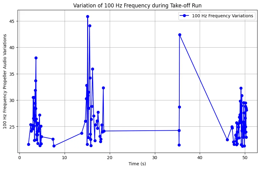
The 100 Hz curve does show genuine spikes at specific moments, and those moments could correspond to throttle movements or propeller speed changes, and they stay at the level of plausibility until a calibrated reading exists to check them against, which at present it does not.
I then repeated the procedure across the range from 50 to 500 Hz in steps of 50, once overlaying every frequency's peaks on a single spectrogram and once plotting each frequency's peak amplitudes on its own axis.
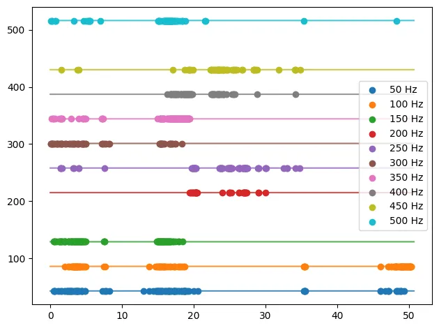
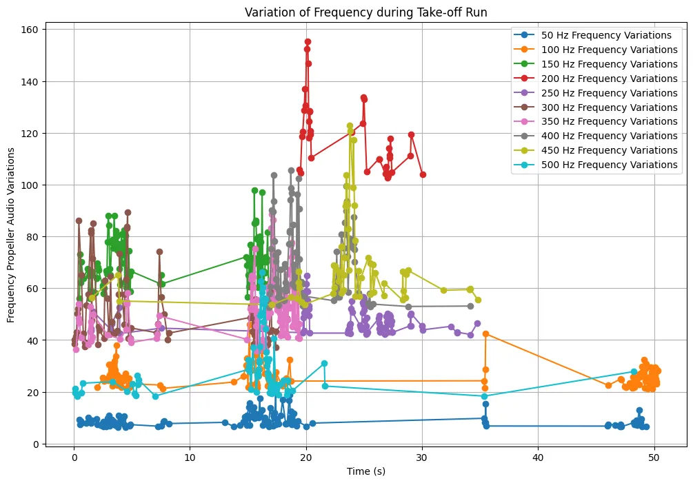
The combined plot is close to unreadable, and I take the unreadability itself as the finding, since it shows that the engine's acoustic energy during takeoff is spread and shifting across the band instead of concentrating in one dominant harmonic, and therefore any single frequency I might have chosen for the analysis, the 100 Hz above included, was always going to show a fragment of the behavior and never the whole of it.
It should be understood what find_peaks is doing underneath its confident name, since the word peak carries more authority than the rule generating it. A sample x[n] is a peak when:
nothing more, and the height I used, mean plus two standard deviations, is a statistical cutoff that knows nothing about propellers, it describes the variability of the loudness curve and only that. The values it returns in properties['peak_heights'] are raw STFT magnitudes, unitless, scaled to the recording's own gain. I have now established that every quantity in this analysis is either a frequency, which is trustworthy, or an amplitude, which is trustworthy as an amplitude and nothing else.
I said earlier that the intervals between peaks in the filtered signal showed no rhythm, and there are two honest reasons for that. The first is physical, an engine accelerating through a takeoff run is not in a steady state, its acoustic signature is changing continuously, and a signal that refuses to display a fixed period should not be tortured into displaying one. The second is a property of the tool, since the STFT buys its frequency resolution with a 2048-sample window, and that same window smears the exact timing of events across its own width, the standard trade-off of any windowed transform, more certainty in frequency costing certainty in time, with no window length that purchases both at once. A wavelet transform trades some frequency precision back in exchange for sharper timing, and it is the next method I intend to run against this recording.
In conclusion, I have established that the frequency content of the recording is solid, the 50 to 2000 Hz band is active throughout the takeoff, the energy in it is distributed across many frequencies, and the individual bins show real amplitude events at specific moments. The engine power interpretation of those events remains unestablished, and it will remain so until two things exist that do not exist today, a calibration tying amplitude at the microphone to a known power output, and a time-frequency method with better timing resolution than the STFT provides. Until then the correct description of this project is that it measured sound precisely and inferred power loosely, and the discipline is in refusing to let the second borrow the precision of the first.